Italian Design Is Coming Home. To Switzerland.
How to turn the launch of a new office into a cultural movement

In 2011 Polyedra, a leading Italian paper distributor, opened a new branch in Switzerland. Usually it would be enough to announce this via an ad in a couple of industry magazines or broadcast the news through a few trade channels. But that seemed a bit dull and predictable to Tommaso Minnetti and I, now working as an independent creative duo, especially as the target audience was a group notoriously hard to impress, the graphic design community.
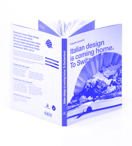
So we proposed creating something that would add value for the client, designers and (we hope) the public.

It all started when we did our typically extensive research and realised that "Italian" graphic design, beloved and respected across the world, owes a substantial debt to Swiss designers for making it so famous; Max Huber, Walter Ballmer, Carlo Vivarelli to name just a few. We saw an opportunity to celebrate this bond between the two countries; to celebrate the past, the present and future of Swiss and Italian design.


'Being an English copywriter working in Amsterdam, albeit with an Italian art director, gives me a unique position on which to comment on Swiss and Italian design.'

Taken from A Beginner's Guide to Swiss and Italian Design

 
We asked 11 of the best designers in both countries to collaborate on new artwork, while to celebrate the future, we organized a competition for students and young designers under the age of 30, offering them the chance to be published in a book alongside the established designers and thus exposure to help further their careers.

And that's how we turned a brief to launch the opening of a new office into a cultural movement involving 22 of the best designers and design agencies from both countries.

The book is now available to buy via Actar.


poster by Mutado and chragokyberneticks


What: Campaign Concept & Production
Client: Polyedra
Agency: Will and Tommaso
Art Direction: Tommaso Minnetti


Yoyo
Bringing a cradle to grave recycled paper brand to life


One of our first things that Tommaso and I made together, and perhaps the best, was this little gem.

Back when we working at our first agency we invented every aspect of this recycled paper brand for Paperlinx Europe's new cradle to grave paper service. We were responsible for everything for the name to the packaging to the TV ads.


The name? Yoyo. Why? Because yoyo paper always comes back. With this campaign we thus established our reputations as the dons of paper advertising (which would lead to Tommaso and I being approached for
the Italian Design is Coming Home pitch a few years later).

Film Comment: We made the film with legendary Dutch director Emiel Steenhuizen. My favourite thing the great man said during the shoot (apart from "Get that Englishman a cup of tea") was "Move that piece of paper a quarter of a millimetre to the right!" Now that's what I call attention to detail.


"Imagine if every sheet of paper your business throws away came back as new paper you could use again and again."

What: Brand Concept, Identity and Campaign
Client: PaperlinX Europe
Agency/Creative Direction: Tan Brand Communications
Art Direction/Concept: Tommaso Minnetti
Film Director: Emiel Steenhuizen


Baster
Holland's Next Top Designer

Baster is Bas Koopmans, one of The Netherland's best graphic designers and one of my best friends (two completely unrelated facts). Bas is a bit of a perfectionist, so much so that it took him a good five years to come up with a website for himself that satisfied his insatiable perfectionism. So when he was finally ready to share his genius with the world, he needed some text that would make his work look even better. So he asked me. And even better he asked me to say absolutely nothing sensible about his


work, but tell a bunch of stories that could be about anything from my early exploits as a skateboarder to cricket.

On a professional level, I should say that this approach to the text gave visitors to the site an intimate insight into Bas, his character and working philosophy that wouldn't have been otherwise possible. On a personal level, it was a lot of fun and I got a free pair of trainers out of it, so everyone went home happy.


'I've moved house a lot recently in the last couple of years. Twelve times to be precise, including a couple of interim stays at Bas' lovely home in Amsterdam West. So I'd like to think that my slightly itinerant lifestyle was the inspiration for the wonderful wrinkle poster: a poster that fits neatly into a small box whenever it needs to be transported between one house and another. It almost makes moving a joy. Almost.'

Taken from baster.nl


'Not hailing from Holland, 2Unlimited were somewhat of an unknown quantity to me. It was only when I landed on these shores that I discovered that what we'd sung fifteen years ago as an ode to my football team's legendary Bulgarian goal machine, was in fact a popular techno ode to hedonism. Well, whatever floats your boat. I'm still waiting for Bas to make me my own version of the poster with the words we used to use back on the terraces of Ipswich:

BO-BO
BO BO BO-BO
BO BO BO-BO
BO-BO BONTCHO GUENTCHEV!'


Taken from baster.nl

What: Website Text